Discover the world of graphic arts: from traditional printmaking to contemporary graphic design. Inspiration for those who appreciate visual creativity.
The world of visual communication has many faces. From age-old printing techniques that artists used to multiply their work, to the modern digital designs we encounter daily on screens and paper. The concept of grafika encompasses it all: a rich tradition that brings art, technique and communication together. For anyone who is mindful of visual aesthetics, for example when choosing beautiful calendars or planners, it is valuable to understand how grafika has shaped our visual culture. In this exploration we take you through the history, the different forms and the enduring relevance of grafika in our daily lives.
The origin of printmaking as an art form
The roots of printmaking reach back to the invention of the printing press. What began as a revolutionary way to reproduce texts quickly grew into a fully fledged art form. Artists discovered that printing techniques were not only functional but also offered artistic possibilities that were unique.
The classical printing techniques
Woodcut, etching, lithography and screen printing make up the four main classical techniques within printmaking. Each method has its own character and visual signature.
Woodcut was the first widespread technique. Artists carved their design into a wooden block, with the raised areas taking the ink. The result? Powerful, high-contrast images with a recognizable graphic character. In the fifteenth and sixteenth centuries, woodcuts were used for everything from religious illustrations to playing cards.
Etching brought greater refinement. By drawing with a needle into a wax layer on a metal plate and then immersing it in acid, delicate lines and subtle tonal variations were produced. Masters like Rembrandt transformed this technique into pure art.
History shows how grafika developed from a purely reproductive medium into an expressive art medium in its own right. Artists began experimenting with the limits of each technique.
Lithography and the democratization of art
The invention of lithography in 1796 was groundbreaking. This technique, based on the principle that grease and water repel each other, made it possible to create more subtle color gradations and soft transitions. Suddenly artists could produce works that in quality were close to paintings, but in editions.
This democratized art in a way that was previously unimaginable. People who could never afford an original painting could now bring high-quality artworks into their homes. The concept grafika thereby gained a broader cultural meaning: it stood not only for technique but also for accessibility.
From analog to digital: graphics in transformation
The twentieth century brought a fundamental shift. Where graphics had for centuries revolved around physical materials, ink, and printing presses, the computer revolution brought a complete transformation. Digital graphics opened doors that had previously been closed.
Computer graphics and new possibilities
The rise of computer graphics in the 1960s and 1970s laid the foundation for a new branch of graphics. Scientists and engineers developed programs that could create images digitally. What began as experimental projects at universities grew into an industry that would come to dominate film, games, and design.
For developers diving into graphics, tools like Google's Grafika project have become valuable. These technical tools demonstrate how complex graphics can be behind the scenes, especially when it comes to mobile devices and video.
Type of graphics
Primary use
Key advantages
Vector graphics
Logos, illustrations, typography
Scalable without loss of quality
Raster graphics
Photographs, digital paintings
Rich color detail and texture
3D graphics
Animation, games, visualization
Realistic depth and movement
Motion graphics
Video, presentations, advertising
Dynamic storytelling
Raster versus vector: two worlds
Within digital graphics there is a fundamental distinction between raster and vector images. Raster graphics consist of pixels, small colored squares that together form an image. Photographs are typical examples. Zoom in and you can see the individual pixels.
Vector graphics work very differently. Instead of pixels, this form uses mathematical formulas to define lines, shapes, and colors. The big advantage? Infinite scalability without quality loss. A vector logo stays sharp whether you print it on a business card or on a ten-meter billboard.
These technical distinctions are crucial for professionals, but also for anyone who deals consciously with visual content. When choosing images for print materials such as calendars, resolution plays a major role.
Graphic arts in education and academia
Universities recognize the importance of graphic arts in our visual culture. From art schools to technical universities, you can find programs focusing on different aspects of graphic arts everywhere.
Curricula and learning paths
Modern graphic arts programs combine technical skills with conceptual thinking. Students not only learn to master software programs but also develop a critical eye for visual communication. University programs in computer graphics cover topics from color theory to 3D modeling.
The spectrum is wide:
Traditional printmaking and graphic techniques
Digital illustration and photo manipulation
Interactive design and user interfaces
Motion graphics and animation
Generative design and algorithmic art
Research and innovation
Academic research in graphic arts goes beyond creating pretty images. Scientists study how people process visual information, how colors influence emotions, and how cultural contexts shape our perception of images. Recent research shows how education in graphic arts can contribute to a broader understanding of visual literacy.
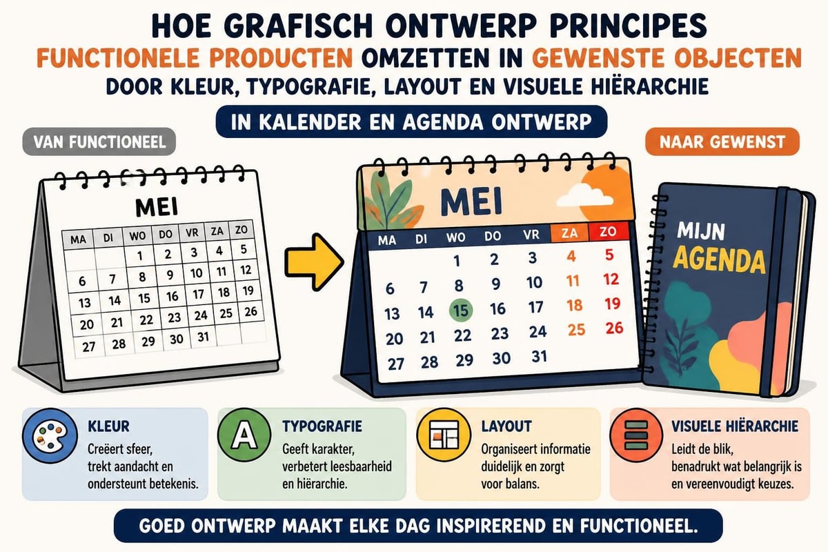
These insights are not only theoretically interesting. They have direct applications in everything from product design to marketing campaigns. Designing a calendar that is not only functional but also visually appealing requires understanding these principles.
Graphic arts in the contemporary art world
As technology advances, graphic arts as an artistic discipline continue to thrive. Museums and galleries dedicate exhibitions to both historical and contemporary graphic arts. This appreciation shows that the art form is far from outdated.
Museum presentations and exhibitions
Grafika exhibitions offer a unique view of artistic developments. The exhibition 'GRÁFIKA. De Picasso a Baldessari', for example, shows the evolution of graphic art in the twentieth century, from Picasso's iconic lithographs to Baldessari's conceptual experiments.
What makes these exhibitions so fascinating is how they demonstrate the versatility of grafika. You see:
Technical virtuosity in classical printmaking techniques
Conceptual depth in contemporary approaches
Experimental use of new materials
Cross-pollination between digital and analog
Contemporary graphic artists
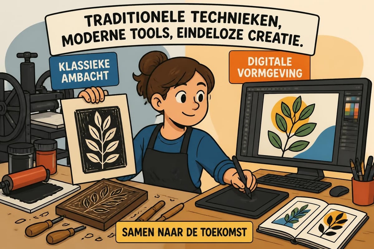
Today, artists work by mixing traditional and modern techniques. They use screen printing for limited editions, combine it with digital elements, or create hybrid works that blur the boundaries between disciplines. This approach reflects how grafika constantly evolves and adapts to new possibilities.
Platforms like Grafika SWPS show how young designers and artists experiment with graphic form. Their work is fresh, unconventional, and inspired by both heritage and innovation.
The language of grafika: terminology and concepts
The word grafika itself is interesting. In Polish 'grafika' refers to both the art form and the printed artwork. This double meaning illustrates how closely process and product are connected.
International variations
Different languages and cultures approach grafika from their own perspective. In Dutch we often speak of grafische vormgeving, drukkunst, or printmaking. Each term emphasizes different aspects of the same phenomenon.
The richness of this terminology reflects the complexity of the field. Grafika is not one thing but a spectrum of practices, techniques, and forms of expression.
Grafika in the commercial domain
Outside galleries and academic institutions, grafika plays a crucial role in the commercial world. From product design to advertising, graphic design is everywhere.
Branding and visual identity
Companies are heavily investing in grafika because they understand that visual identity defines their brand. A well-designed logo, a thoughtful color scheme, and consistent typography — all of this forms the graphic foundation of a brand.
Belangrijke elementen in commerciële grafika:
Logo-ontwerp en merkidentiteit
Verpakkingsdesign
Typografie en lettertypekeuze
Kleurpsychologie
Lay-out en compositie
Beeld en illustratie
Voor bedrijven die fysieke producten verkopen, zoals kalenders, is kwalitatieve grafika essentieel. Een mooie kalender voor 2027 onderscheidt zich niet alleen door functionaliteit, maar vooral door visueel design. De keuze voor een bepaalde grafische stijl, kleurenpalet of typografie bepaalt of het product aansluit bij de doelgroep.
Bij Kalenderwinkel.nl vind je een breed assortiment waarin verschillende grafische stijlen samenkomen. Van minimalistische designs tot rijk geïllustreerde themakalenders, elk product weerspiegelt bewuste grafische keuzes.
Print versus scherm: verschillende vereisten
Grafika voor print verschilt fundamenteel van grafika voor digitale schermen. Kleurmodellen (CMYK voor print, RGB voor scherm), resolutie-eisen en bestandsformaten variëren. Een ontwerper moet begrijpen hoe grafika zich gedraagt in verschillende media.
Aspect
Print grafika
Digitale grafika
Kleurmodel
CMYK
RGB
Resolutie
300+ DPI
72-150 PPI
Bestandstype
PDF, TIFF
JPG, PNG, SVG
Kleurconsistentie
Pantone-systemen
Kleurprofielen
Voor wie kalenders ontwerpt of selecteert, zijn deze technische details belangrijk. De kwaliteit van gedrukte grafika hangt af van correcte voorbereiding. Een kalender die er op scherm prachtig uitziet, kan teleurstellen in print als de technische specificaties niet kloppen.
Trends en toekomstige ontwikkelingen
Grafika blijft zich ontwikkelen. Nieuwe technologieën en culturele verschuivingen creëren voortdurend nieuwe mogelijkheden en uitdagingen.
AI en generatieve grafika
Kunstmatige intelligentie verandert hoe we grafika creëren. Tools die automatisch afbeeldingen genereren of designs optimaliseren worden steeds geavanceerder. Dit roept vragen op over creativiteit, auteursrecht en de rol van de menselijke ontwerper.
Toch blijft menselijke creativiteit centraal staan. AI kan ondersteunen, versnellen en nieuwe mogelijkheden bieden, maar de conceptuele en emotionele dimensies van grafika vragen om menselijk inzicht.
Sustainability and ethics
Modern graphic professionals are increasingly thinking about sustainability. What materials do we use for print? How do we minimize waste in the production process? These questions are urgent in an age of climate awareness.
Ethical considerations also play a role. How do we represent diversity in visual communication? How do we avoid stereotypes? Graphics are never neutral; they always carry values and assumptions.
Accessibility and inclusivity
There is growing awareness that graphics should be accessible to everyone, including people with visual impairments. Colors with sufficient contrast, readable fonts, and thoughtful information structures make graphics more inclusive. This is not only socially desirable but also enriches the field.
Graphics in the everyday environment
We are surrounded by graphics. From the app icons on your smartphone to the design of traffic signs, from magazines to websites — visual communication everywhere is shaped by graphic designers.
The quiet impact of good design
The paradox of good graphics is that they often go unnoticed. When a book is pleasant to read, a website is intuitive to navigate, or a calendar is clearly organized, we take it for granted. Yet this is the result of careful graphic work.
Bad graphics stand out. Unreadable text, messy layouts, clashing colors — all of this disrupts the user experience. The art is to create graphics that support without dominating, that inform without overwhelming.
Personal taste and cultural context
Graphics are also a matter of taste. What one person finds elegant, another may find boring. What in one culture is seen as colorful and cheerful can come across as garish in another context. This subjectivity makes graphics so rich and complex.
That's why it's important to have diversity in graphic offerings. When choosing a calendar or planner, your choice reflects your personal preference for certain graphic styles. Some prefer minimalism, others maximal visual richness.
Practical applications for the general public
You don't have to be a professional to handle graphics consciously. Anyone who creates presentations, designs social media posts, or even edits photos is actually working with graphics.
Basic principles for non-designers
A few simple principles quickly improve the quality of your visual communication:
Hierarchy: Make clear which element is the most important
Whitespace: Give elements breathing room
Consistency: Use a limited palette of colors and typefaces
Contrast: Ensure text is easily readable against the background
Alignment: Align elements neatly
These principles are not arbitrary. They are rooted in how our brain processes visual information. When applied well, they make any form of grafika more effective.
Tools and resources
There are countless tools available for people who want to work with grafika, from professional software like Adobe Creative Suite to accessible apps like Canva. The barrier to experiment with graphic design is lower than ever.
Still, knowledge of fundamental principles remains essential. Powerful software does not automatically make you a good designer. Understanding composition, color, typography and communication is crucial.
The enduring relevance of analog grafika
Despite the digital revolution, analog grafika remains relevant. There is even a renaissance underway in traditional print techniques.
The charm of the handmade
In a world of perfect digital reproductions, people appreciate the unique imperfections of handmade grafika. Each print is slightly different, bearing the marks of the making process. This human dimension appeals to people.
Artists and hobbyists are rediscovering techniques like linocut, screen printing and bookbinding. Workshops and studios where you can learn these techniques are popping up everywhere. The tactile pleasure of working with your hands, the smell of ink, the surprise of the result — all of this makes analog grafika valuable.
Digital-analog hybrid workflows
It's interesting how makers combine digital and analog methods. They sketch by hand, scan their work, edit it digitally, print it out and then continue working on it by hand. This hybrid approach combines the best of both worlds.
You can also see this mix in the world of calendars and planners. Designers use digital tools for layout and composition, but incorporate hand-drawn elements or textures to add warmth and personality.
Grafika is a fascinating discipline that combines art, craft and communication. From centuries-old print techniques to advanced digital tools, grafika continually evolves while keeping its core: creating meaningful visual communication. For those who deliberately choose products with thoughtful design, this concept is valuable. At Kalenderwinkel.nl you'll find calendars and planners that showcase a variety of graphic styles, so you can choose a product that perfectly matches your aesthetic preferences and practical needs for 2027.